
Schema Formio

This tutorial shows how to use the @tsed/schema-formio package to generate Form.io compatible schemas from TypeScript classes using decorators.
Installation
npm install --save @tsed/schema-formioyarn add @tsed/schema-formiopnpm add @tsed/schema-formiobun add @tsed/schema-formioIntroduction
The @tsed/schema-formio package allows you to transform a Schema declared with @tsed/schema into a valid Form.io schema. This is particularly useful when you want to automatically generate forms based on your TypeScript models.
The package supports most of the JsonSchema decorators provided by @tsed/schema (like Property, Required, CollectionOf, etc.) and adds additional decorators to customize the Form.io components generated for your class properties.
Basic Usage
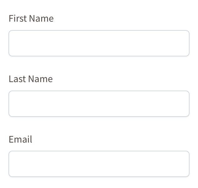
Here's a simple example of how to use the package:
import {getFormioSchema, Form} from "@tsed/schema-formio";
import {Property} from "@tsed/schema";

@Form()
export class User {
  @Property()
  firstName: string;

  @Property()
  lastName: string;

  @Property()
  email: string;
}

// Generate the Form.io schema
const formioSchema = await getFormioSchema(User);
console.log(formioSchema);{
"components": [
{
"type": "textfield",
"key": "firstName",
"label": "First Name",
"input": true
},
{
"type": "textfield",
"key": "lastName",
"label": "Last Name",
"input": true
},
{
"type": "email",
"key": "email",
"label": "Email",
"input": true
}
]
}This will generate a Form.io schema with text fields for firstName, lastName, and email.
TIP
You can play with Formio builder to see the generated schema in action: Form.io Builder.
Decorators
Form
The Form decorator is used to mark a class as a Form.io form. It's required for the getFormioSchema function to work properly.
import {Form} from "@tsed/schema-formio";

@Form()
export class User {
  // properties
}
Component
The Component decorator allows you to define any extra Form.io metadata on a decorated property:
import {Form, Component} from "@tsed/schema-formio";
import {Property} from "@tsed/schema";

@Form()
export class User {
  @Component({
    tooltip: "Enter your username",
    placeholder: "Username",
    description: "Your unique username for the system"
  })
  @Property()
  username: string;
}{
"components": [
{
"type": "textfield",
"key": "username",
"label": "Username",
"input": true,
"tooltip": "Enter your username",
"placeholder": "Username",
"description": "Your unique username for the system"
}
],
"display": "form",
"name": "user",
"title": "User",
"type": "form"
}Note
Tooltip, Placeholder, and Description decorators can also be used directly on properties to achieve the same effect.
Currency
The Currency decorator changes a property to a Currency component:
import {Form, Currency} from "@tsed/schema-formio";
import {Property} from "@tsed/schema";

@Form()
export class Product {
  @Property()
  name: string;

  @Currency()
  @Property()
  price: number;
}{
"components": [
{
"type": "textfield",
"key": "name",
"label": "Name",
"input": true
},
{
"type": "currency",
"key": "price",
"label": "Price",
"input": true,
"currency": "USD",
"delimiter": true,
"allowNegative": false
}
],
"display": "form",
"name": "product",
"title": "Product",
"type": "form"
}DataSourceJson
The DataSourceJson decorator adds a custom data source for a Select component:
import {Form, DataSourceJson, Select} from "@tsed/schema-formio";
import {Property} from "@tsed/schema";

@Form()
export class User {
  @Select()
  @DataSourceJson([
    {value: "admin", label: "Administrator"},
    {value: "user", label: "Regular User"},
    {value: "guest", label: "Guest"}
  ])
  @Property()
  role: string;
}
DataSourceUrl
The DataSourceUrl decorator fetches data source from an endpoint for a Select component:
import {Form, DataSourceUrl, Select} from "@tsed/schema-formio";
import {Property} from "@tsed/schema";

@Form()
export class User {
  @Select()
  @DataSourceUrl("/api/roles")
  @Property()
  role: string;
}
Hidden
The Hidden decorator changes the property to a Hidden component:
import {Form, Hidden} from "@tsed/schema-formio";
import {Property} from "@tsed/schema";

@Form()
export class User {
  @Hidden()
  @Property()
  id: string;

  @Property()
  name: string;
}
InputTags
The InputTags decorator changes the property to an InputTags component:
import {Form, InputTags} from "@tsed/schema-formio";
import {Property, CollectionOf} from "@tsed/schema";

@Form()
export class Article {
  @Property()
  title: string;

  @InputTags()
  @CollectionOf(String)
  @Property()
  tags: string[];
}
Label
The Label decorator customizes the label for a component:
import {Form, Label} from "@tsed/schema-formio";
import {Property} from "@tsed/schema";

@Form()
export class User {
  @Label("First Name")
  @Property()
  firstName: string;

  @Label("Last Name")
  @Property()
  lastName: string;
}
Mask
The Mask decorator adds an input mask to a component:
import {Form, Mask} from "@tsed/schema-formio";
import {Property} from "@tsed/schema";

@Form()
export class User {
  @Mask("(999) 999-9999")
  @Property()
  phoneNumber: string;

  @Mask("99/99/9999")
  @Property()
  birthDate: string;
}
MaxWords
The MaxWords decorator sets the maximum number of words for a text component:
import {Form, MaxWords, Textarea} from "@tsed/schema-formio";
import {Property} from "@tsed/schema";

@Form()
export class Article {
  @Property()
  title: string;

  @Textarea()
  @MaxWords(100)
  @Property()
  summary: string;
}
MinWords
The MinWords decorator sets the minimum number of words for a text component:
import {Form, MinWords, Textarea} from "@tsed/schema-formio";
import {Property} from "@tsed/schema";

@Form()
export class Article {
  @Property()
  title: string;

  @Textarea()
  @MinWords(10)
  @Property()
  summary: string;
}
ModalEdit
The ModalEdit decorator enables modal editing for a component:
import {Form, ModalEdit} from "@tsed/schema-formio";
import {Property} from "@tsed/schema";

@Form()
export class User {
  @ModalEdit()
  @Property()
  profile: object;
}
Multiple
The Multiple decorator sets the multiple flag on a property:
import {Form, Multiple, Select} from "@tsed/schema-formio";
import {Property, CollectionOf} from "@tsed/schema";

@Form()
export class User {
  @Select()
  @Multiple()
  @CollectionOf(String)
  @Property()
  roles: string[];
}
OpenWhenEmpty
The OpenWhenEmpty decorator makes a component open when it's empty:
import {Form, OpenWhenEmpty} from "@tsed/schema-formio";
import {Property} from "@tsed/schema";

@Form()
export class User {
  @OpenWhenEmpty()
  @Property()
  comments: string;
}
Password
The Password decorator changes the property to an input Password component:
import {Form, Password} from "@tsed/schema-formio";
import {Property} from "@tsed/schema";

@Form()
export class User {
  @Property()
  email: string;

  @Password()
  @Property()
  password: string;
}
Placeholder
The Placeholder decorator adds a placeholder to a component:
import {Form, Placeholder} from "@tsed/schema-formio";
import {Property} from "@tsed/schema";

@Form()
export class User {
  @Placeholder("Enter your email")
  @Property()
  email: string;

  @Placeholder("Enter your password")
  @Property()
  password: string;
}
Prefix
The Prefix decorator adds a prefix to a component:
import {Form, Prefix} from "@tsed/schema-formio";
import {Property} from "@tsed/schema";

@Form()
export class Product {
  @Property()
  name: string;

  @Prefix("$")
  @Property()
  price: number;
}
Select()
The Select decorator changes the property to a Select component:
import {Form, Select} from "@tsed/schema-formio";
import {Property, Enum} from "@tsed/schema";

export enum UserRole {
  ADMIN = "admin",
  USER = "user",
  GUEST = "guest"
}

@Form()
export class User {
  @Property()
  name: string;

  @Select()
  @Enum(UserRole)
  @Property()
  role: UserRole;
}
Suffix
The Suffix decorator adds a suffix to a component:
import {Form, Suffix} from "@tsed/schema-formio";
import {Property} from "@tsed/schema";

@Form()
export class Product {
  @Property()
  weight: number;

  @Suffix("kg")
  @Property()
  weight: number;
}
TableView
The TableView decorator controls whether a property is displayed in a table view:
import {Form, TableView} from "@tsed/schema-formio";
import {Property} from "@tsed/schema";

@Form()
export class User {
  @TableView(true)
  @Property()
  name: string;

  @TableView(false)
  @Property()
  password: string;
}
Tabs
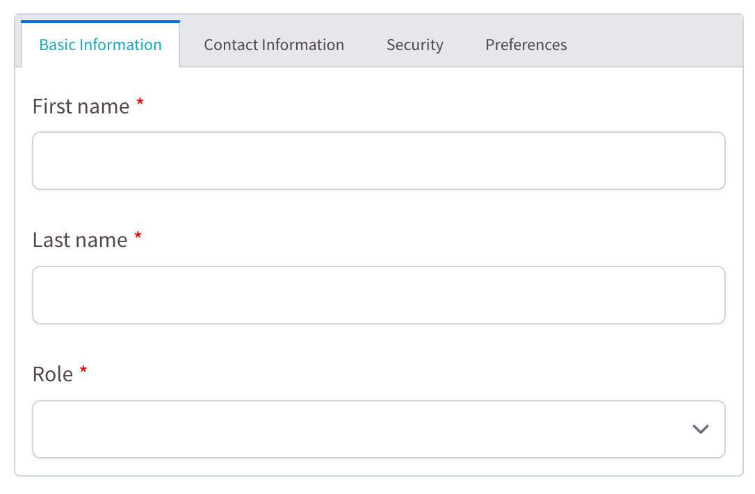
The Tabs decorator groups properties using the Form.io tab component:
import {Form, Tabs} from "@tsed/schema-formio";
import {Property} from "@tsed/schema";

@Form()
export class User {
  @Tabs("Basic Information")
  @Property()
  firstName: string;

  @Tabs("Basic Information")
  @Property()
  lastName: string;

  @Tabs("Contact Information")
  @Property()
  email: string;

  @Tabs("Contact Information")
  @Property()
  phone: string;

  @Tabs("Security")
  @Property()
  password: string;
}
Textarea
The Textarea decorator changes a component to a Textarea component:
import {Form, Textarea} from "@tsed/schema-formio";
import {Property} from "@tsed/schema";

@Form()
export class Article {
  @Property()
  title: string;

  @Textarea()
  @Property()
  content: string;
}
TextCase
The TextCase decorator sets the text case for a component:
import {Form, TextCase} from "@tsed/schema-formio";
import {Property} from "@tsed/schema";

@Form()
export class User {
  @TextCase("uppercase")
  @Property()
  code: string;

  @TextCase("lowercase")
  @Property()
  email: string;
}
Tooltip
The Tooltip decorator adds a tooltip to a component:
import {Form, Tooltip} from "@tsed/schema-formio";
import {Property} from "@tsed/schema";

@Form()
export class User {
  @Tooltip("Enter your full name")
  @Property()
  name: string;

  @Tooltip("Enter a valid email address")
  @Property()
  email: string;
}
Validate
The Validate decorator adds custom validation to a component:
import {Form, Validate} from "@tsed/schema-formio";
import {Property} from "@tsed/schema";

@Form()
export class User {
  @Validate({
    required: true,
    minLength: 3,
    maxLength: 50
  })
  @Property()
  username: string;

  @Validate({
    required: true,
    pattern: "^[^\\s@]+@[^\\s@]+\\.[^\\s@]+$"
  })
  @Property()
  email: string;
}
Combining Decorators
You can combine multiple decorators to customize your Form.io components:
import {Form, Select, DataSourceJson, Placeholder, Required, Tooltip} from "@tsed/schema-formio";
import {Property} from "@tsed/schema";

@Form()
export class User {
  @Property()
  @Required()
  @Tooltip("Enter your full name")
  @Placeholder("John Doe")
  name: string;

  @Select()
  @DataSourceJson([
    {value: "admin", label: "Administrator"},
    {value: "user", label: "Regular User"},
    {value: "guest", label: "Guest"}
  ])
  @Required()
  @Property()
  role: string;
}
Complete Example
Here's a more complete example showing how to use various decorators together:
import {Form, Tabs, InputTags, Password, Textarea, Select, TableView, Placeholder, Tooltip} from "@tsed/schema-formio";
import {Property, Required, Email, MinLength, MaxLength, CollectionOf, Enum} from "@tsed/schema";

export enum UserRole {
  ADMIN = "admin",
  USER = "user",
  GUEST = "guest"
}

@Form()
export class User {
  // Basic Information Tab
  @Tabs("Basic Information")
  @Required()
  @Property()
  firstName: string;

  @Tabs("Basic Information")
  @Required()
  @Property()
  lastName: string;

  @Tabs("Basic Information")
  @Select()
  @Enum(UserRole)
  @Required()
  @Property()
  role: UserRole;

  // Contact Information Tab
  @Tabs("Contact Information")
  @Required()
  @Email()
  @Placeholder("example@email.com")
  @Tooltip("Enter a valid email address")
  @Property()
  email: string;

  @Tabs("Contact Information")
  @Property()
  phone: string;

  @Tabs("Contact Information")
  @Textarea()
  @Property()
  address: string;

  // Security Tab
  @Tabs("Security")
  @Password()
  @Required()
  @MinLength(8)
  @MaxLength(50)
  @Placeholder("Enter a strong password")
  @Property()
  password: string;

  // Preferences Tab
  @Tabs("Preferences")
  @InputTags()
  @CollectionOf(String)
  @TableView(true)
  @Property()
  interests: string[];

  @Tabs("Preferences")
  @Textarea()
  @Property()
  bio: string;
}

// Generate the Form.io schema
const formioSchema = await getFormioSchema(User);
This example creates a form with four tabs (Basic Information, Contact Information, Security, and Preferences) and various field types with different validations and customizations as follows:
Conclusion
The @tsed/schema-formio package provides a powerful way to generate Form.io schemas from TypeScript classes using decorators. By combining decorators from both @tsed/schema and @tsed/schema-formio, you can create complex forms with various field types, validations, and customizations.
It becomes easy to maintain your forms alongside your TypeScript models, ensuring type safety and consistency across Ts.ED applications.